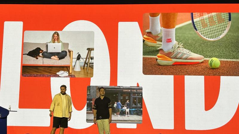
That Thing’s co-founders, Joe Weir and Wark Williams, took to the stage on the first day of Designyatra to share the importance of integrating writing and design, tackling complex brands and ensuring brand messaging is clear and impactful.
That Thing as an agency has collaborated with businesses across various industries and sectors— from automotive and architecture to FinTech, fitness, industrial manufacturing, media, and music. More recently, they were partnering with a company headed to the moon to harness its energy.
During their session, the duo shared that in today’s economy, the key to an ad agency is to help brands communicate their unique value proposition effectively.
Reflecting on the origins of their company, Weir remarked, "We started after, coming from different places, and we found each other. We realised that the combination worked well, and we kept winning work. For three years, we had no name, no website—just projects."
This organic start was marked by a focus on producing impactful work rather than traditional branding frameworks.
Weir recalling a moment of self-realisation, said, "We better send ourselves out. But then came the question: What are we going to be called? What are we going to do?"
The answer to that question came after an arduous introspective process.
"The smart thing would have been to just put our names on the door," Weir admitted. "But we were young, maybe a bit stupid, naive, and idealistic. So we thought, let’s interrogate the industry before calling ourselves anything."
This deliberation led to a crucial revelation: "Writing and design belong together. It's something the ad industry figured out long ago. But strangely, in branding, this wasn’t always the case."
This fusion of art and copy became a cornerstone of their approach, influencing the trajectory of their work, especially during the pandemic when collaboration was essential.
Williams highlighted the second foundational belief: "We knew we wanted to take on complex, meaningful brands and businesses rather than simple, flashy ones. The industry has become obsessed with digital, consumer retail, and tech, but we got our kicks from industrial, B2B-type businesses."
Their choice to focus on industries that drive real-world change provided them with a unique edge. They found satisfaction in working with brands that "needed real change," and their passion for industrial and B2B spaces became the heart of their portfolio.
Joe added another dimension to their ethos: "We knew brand mattered, but we also felt there was a lot of, as we’d say in London, 'bollocks' about branding."
Their no-nonsense, authentic approach to branding set them apart. By avoiding the "trap" of meaningless jargon, they ensured that every project was deeply rooted in the identity of the businesses they represented.
Weir expanded on this, reflecting on their impact. "The businesses that we worked for were fantastic businesses, a lot of the time doing some great stuff, but they were either struggling to get investments, win over new audiences, or even recruit people."
He explained how branding helped turn things around. "It was amazing how much stuff started to fall into place. We started to see that investment coming. We started to see the culture change. We started to see audiences engage with them," shared Weir.
Williams built on this theme of authenticity and clarity. "In the work we did, the design work was never, ever just cosmetic. It was about distilling what the business was and then showing it off. People in the real world don't think about brands in the same way we do—they make snap decisions, have gut reactions, and pigeonhole brands."
This awareness of audience behaviour drove them to craft branding strategies that resonated on a human level.
An example of their transformative work came when discussing a project for an investment management client involved in clean energy. Initially, the client described themselves in dense financial jargon, which failed to capture the attention of their audience.
Williams said, "They were only struggling to engage the audience and really get that success out into the world. Their culture was a bit flat too." The team’s solution was to distil the brand’s essence into something both unique and memorable: "radically steady."
Williams recounted how this concept took shape. "We started thinking about things that were going to stick around for a while. We found the Galapagos giant tortoise after a recent family holiday."
Though the tortoise became an unusual mascot, the symbolism it represented—steadiness, longevity, and character—captured the essence of the brand.
"We took it into the client, and after some initial resistance, the CEO couldn’t stop thinking about it," Weir said with a grin. "We had the symbol we needed."
Weir further elaborated on the success of this approach: "It meant that we could create the identity for the master brand based exactly on that linguistically. We were able to chunk up their offer and break it down into things like 'radically real,' 'radically inventive,' and 'steadily story' to make complex concepts clear and memorable."
Another project, working with Virgin Active, illustrated their ability to break through industry norms. The team was tasked with disrupting the UK gym industry, which had become stagnant. Williams remarked, "Rather than just going for the 15% of the population who are gym members, we said, let’s talk to the 85% who are tuned out completely." Their research into behavioural science led them to the key message: "The secret to exercise isn’t a quick fix. It’s about persistence, sticking with it, doing enough."
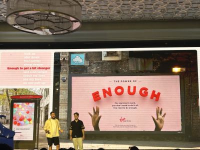
As Weir put it, "Branding isn’t about perfection. It’s about persistence. And that’s the radical thing that transforms industries."


